Checkout flow redesign
+29% conversion rate achieved with 3 subtle changes
Introduction
I worked as a product designer at Zent Care, a wellness e-commerce. At the time we were struggling with a low conversion rate, despite having good traffic.
Stakeholders couldn't pin down the cause. There were talks about the products themselves, the product pages, brand credibility or even the tone of the copy.
As a product designer I decided to dig deeper and look into the numbers.
Peeling the problem apart
The true challenge is finding the root
Low conversion rate
Traffic was healthy and carts were filling up, but the revenue never followed.
I performed a funnel analysis to understand our users' behavior and identify the cause of the problem.
Key findings
How I got there
Fundamental parts of my process in this project
What could fix it
Considered options that would solve our problem
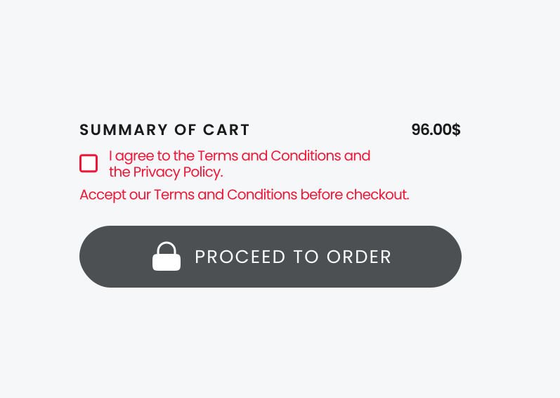
Pros
- Users are told exactly what is blocking them after a failed attempt
- Leaves the flow itself untouched
Cons
- The button still looks grey and locked until someone taps it
- The consent checkbox still blocks the way into checkout
What shipped, and why
Simplest solution that eliminates every bit of friction
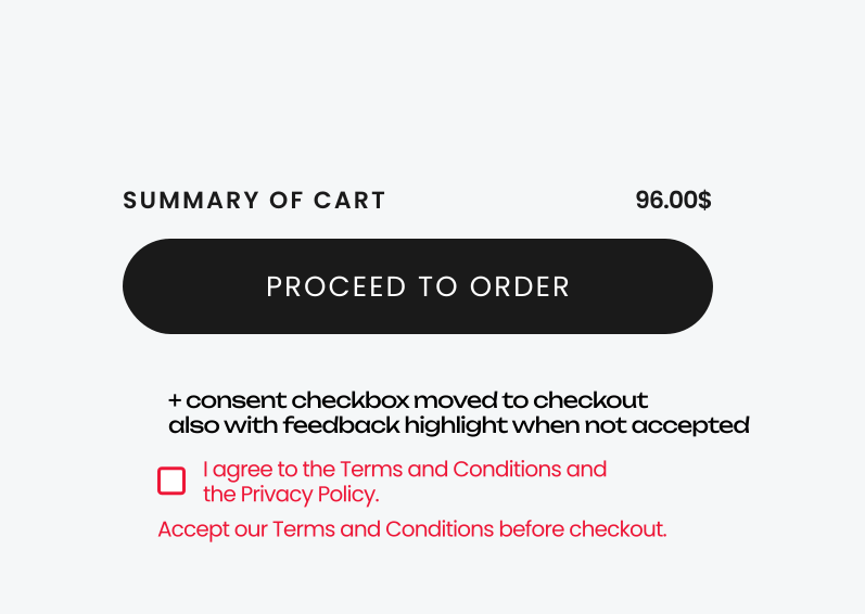
Why this solution?
- The main goal was to remove every possible source of friction before checkout.
- The pay button became a clear primary button, so it never looks disabled.
- We removed the lock icon to keep the button simple, even though we hadn't confirmed that assumption with users.
- Consent moved to checkout, where most e-commerce sites keep it.
- The checkbox highlights if someone tries to pay without accepting it.
What changed
The results and the learnings
What I'd do differently
I had to ship all three changes at once. Given more room, I'd run them as sequential tests to isolate which one actually drove the result, and interview users to confirm the lock icon was really the problem, not just my assumption.
The lesson
Always trace a metric back to its source. A conversion number means little without the full context around it.